Most job platforms are built for formal, long-term hiring processes not for young people who need something fast, accessible, and relevant. On the employer side, the process of posting and managing job listings is often complex and slow. The challenge was to design two distinct yet seamlessly connected experiences: one that feels fun and familiar for job seekers, and one that makes posting a job feel effortless for employers.

We began by understanding the habits and expectations of Gen Z and young millennials. Job searching for this group is often spontaneous, on-the-go, and emotionally driven — so the experience needed to reflect those behaviors.
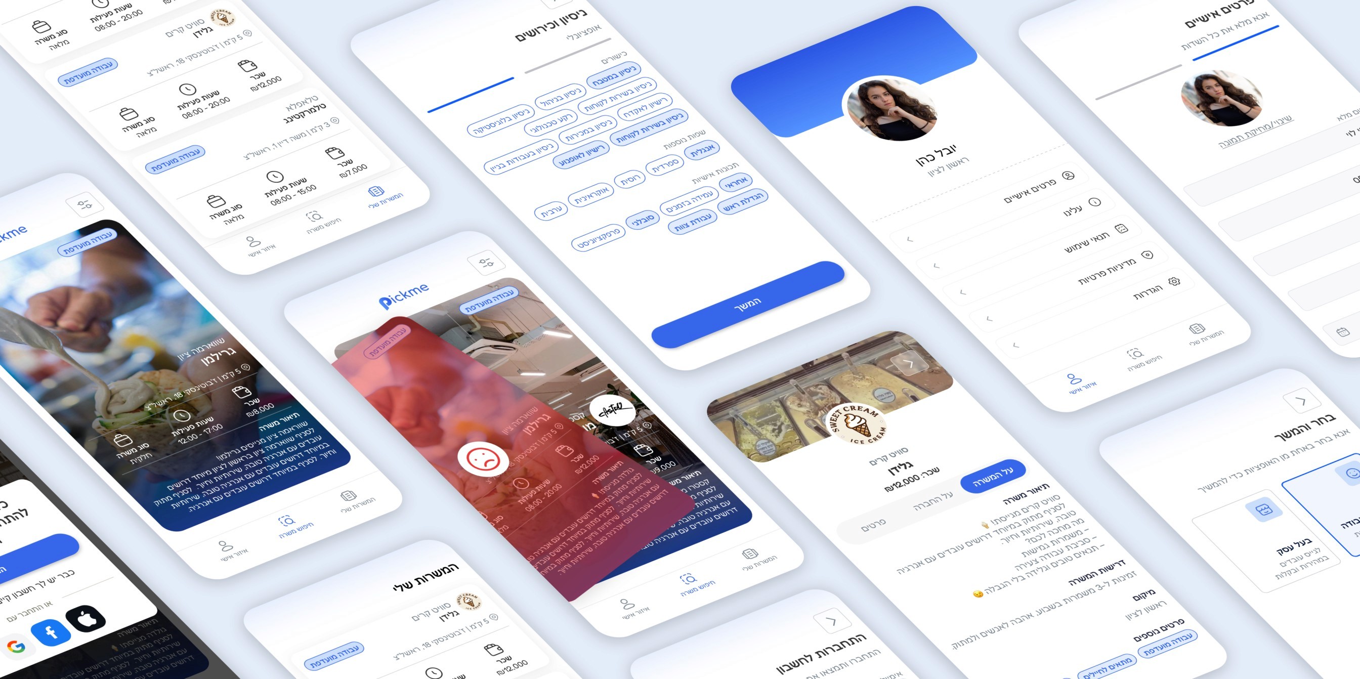
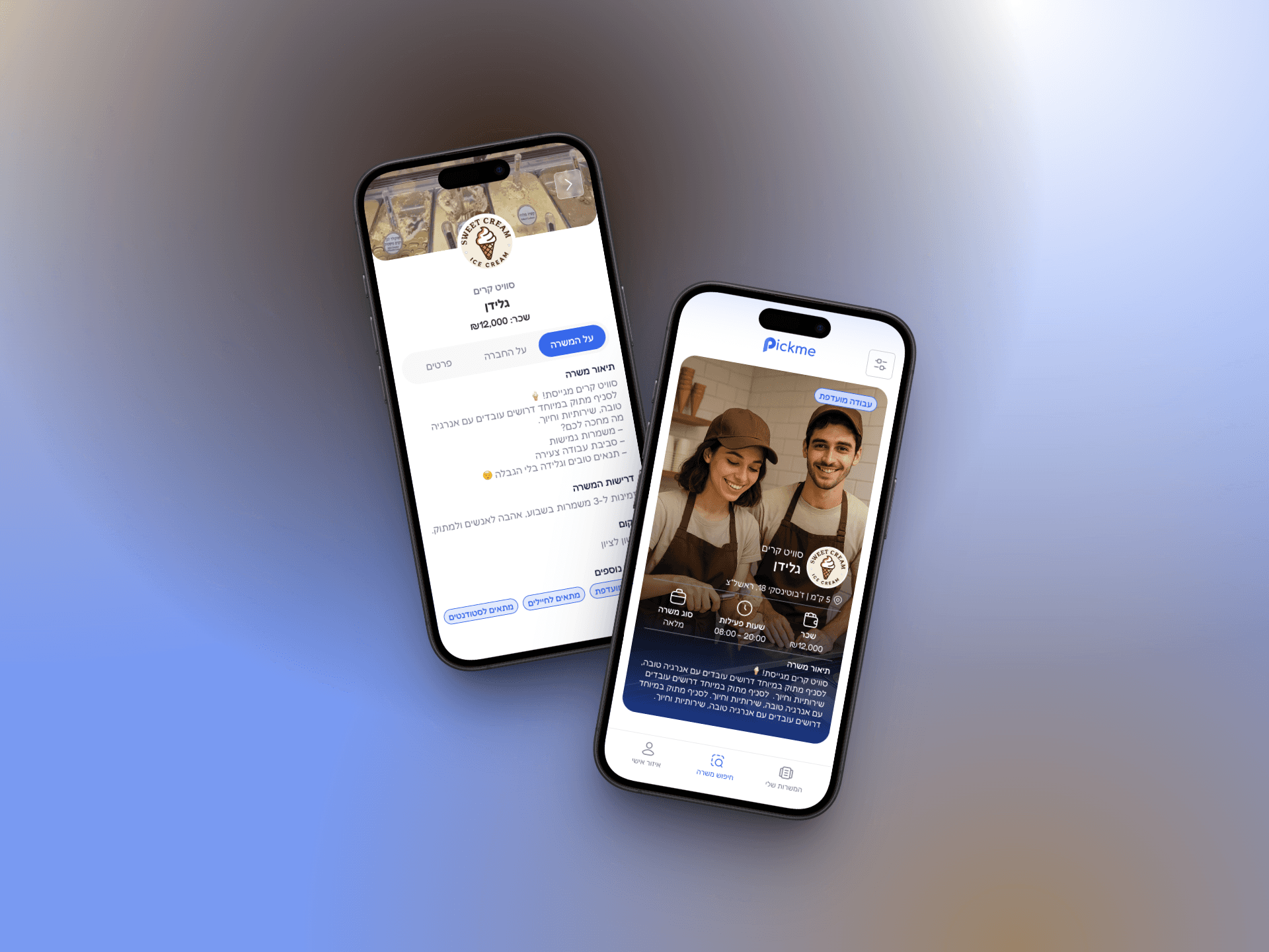
For job seekers, we created a swipe-based interface designed for mobile, inspired by the usability of popular social and dating apps. Users can swipe right to save or apply to a job, and left to skip, making the process quick, visual, and intuitive. Each job card includes essential information like wage, location, shift type, and tags such as “student-friendly” or “evening shift.” The overall tone is casual and accessible, encouraging exploration and minimizing barriers to entry.
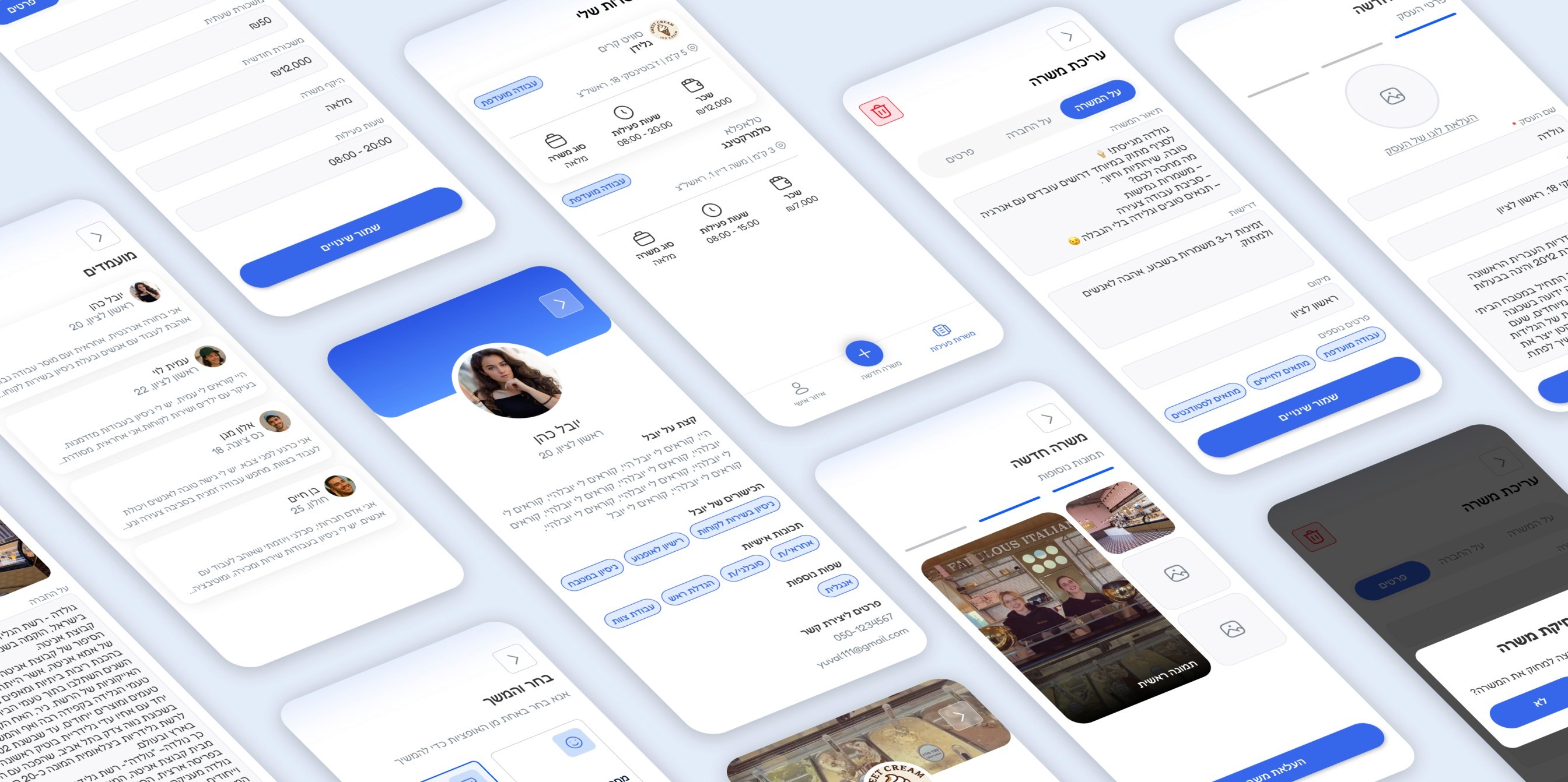
For business, we focused on speed and clarity. The interface allows them to easily publish new job openings in just a few steps without lengthy forms or technical jargon. Employers can set job details, requirements, compensation, and contact preferences, all through a simple, guided flow that’s designed for users with limited time or experience in hiring.
To ensure consistency, we maintained a unified visual language and tone across both sides of the platform, emphasizing ease, friendliness, and mobile responsiveness.